Flush, revised
All three notes applied to Flush: top asset raised, the date broken to two lines and sized up toward the time, and the partnership line broken after “with” and enlarged. The six differ only in how far each goes — the settings are printed on every card, so you can pick by number. Earlier rounds are kept below.
- Arden Fair logo + PRESENTS
- Ofrendas y Recuerdos lockup
- Saturday, October 24 · 1–4 PM
- Lower Level near RH Outlet
- In partnership with Visionary Collective
Round one set the venue at 34px — about 12pt in the hand, too small. Round two runs a fixed scale, nothing below 36px, and the copy block measures itself so it can never collide with the partnership line.
Every card reads LOWER LEVEL NEAR RH OUTLET. The previous cards said JCPenney; all six live files have already been re-rendered with the fix, so nothing wrong is on air while you choose.
Portrait 15s is now EL15P only. VU15P, PQ15P and OF15P are out of the deck — their masters are still on disk if you want one back.
Six revisions
Flush · your three notes click any card for full resolutionOne structural change underneath: the card now fits itself. The partnership block is anchored as low as the UI band allows, the main block is centred in whatever remains, and if larger date type would crowd it the lockup shrinks rather than the type — because the type sizes are the thing being chosen. Two assertions fail the build if either block would touch the other or the UI band.
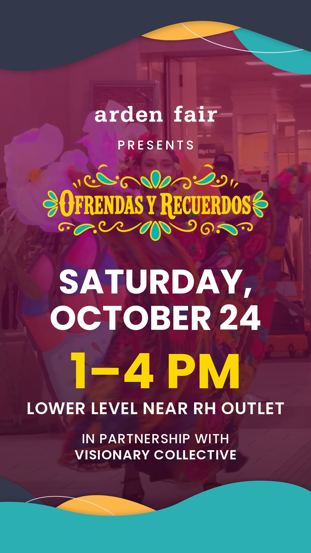
Equilibrio
Recommendedtop −60 · date 118 · time 170 · partner 46
Date at 118 reads clearly as a pair with the time without crowding it, and this setting keeps the largest lockup of the six. The most balanced of the set.
F1_equilibrio
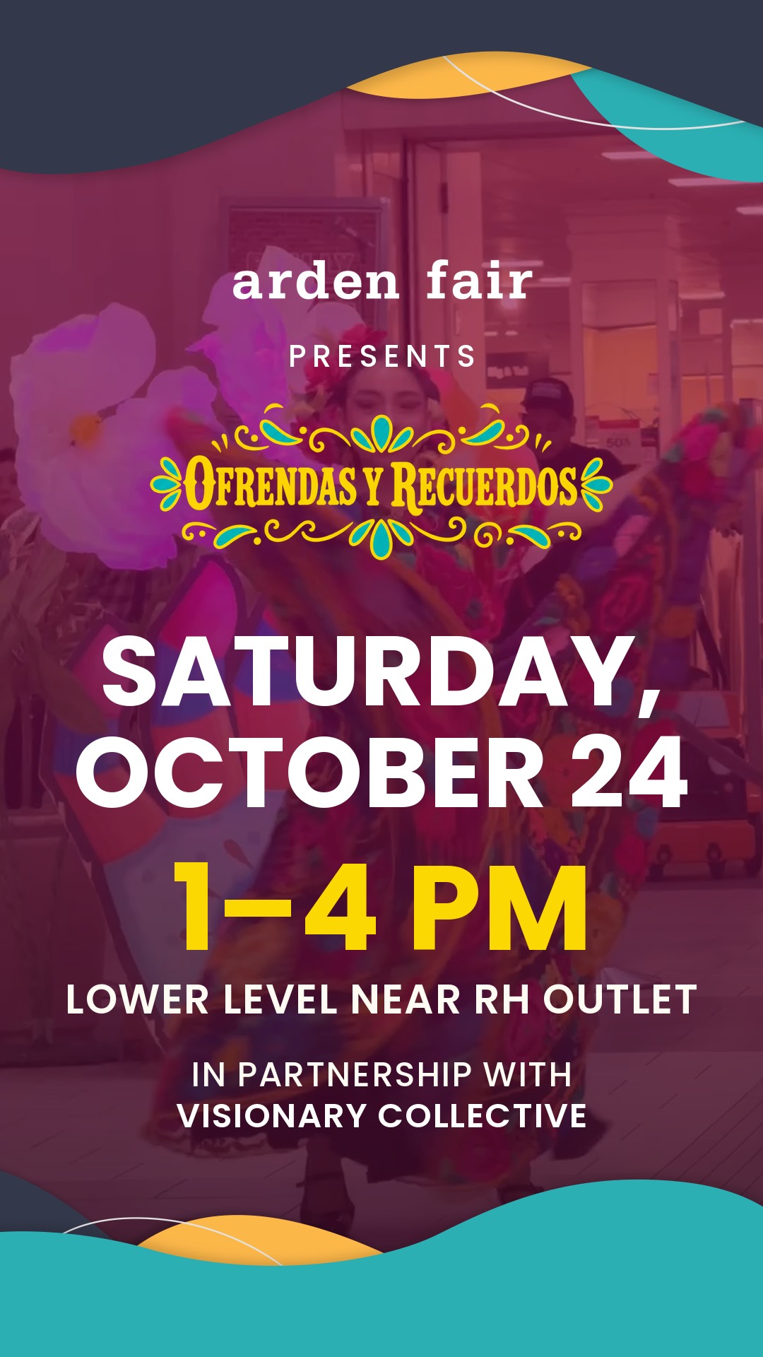
Pareja
Date-forwardtop −60 · date 140 · time 170 · partner 48 — date nearly matches the time
Date at 140 — nearly the size of the time. Costs some lockup width.
F2_pareja
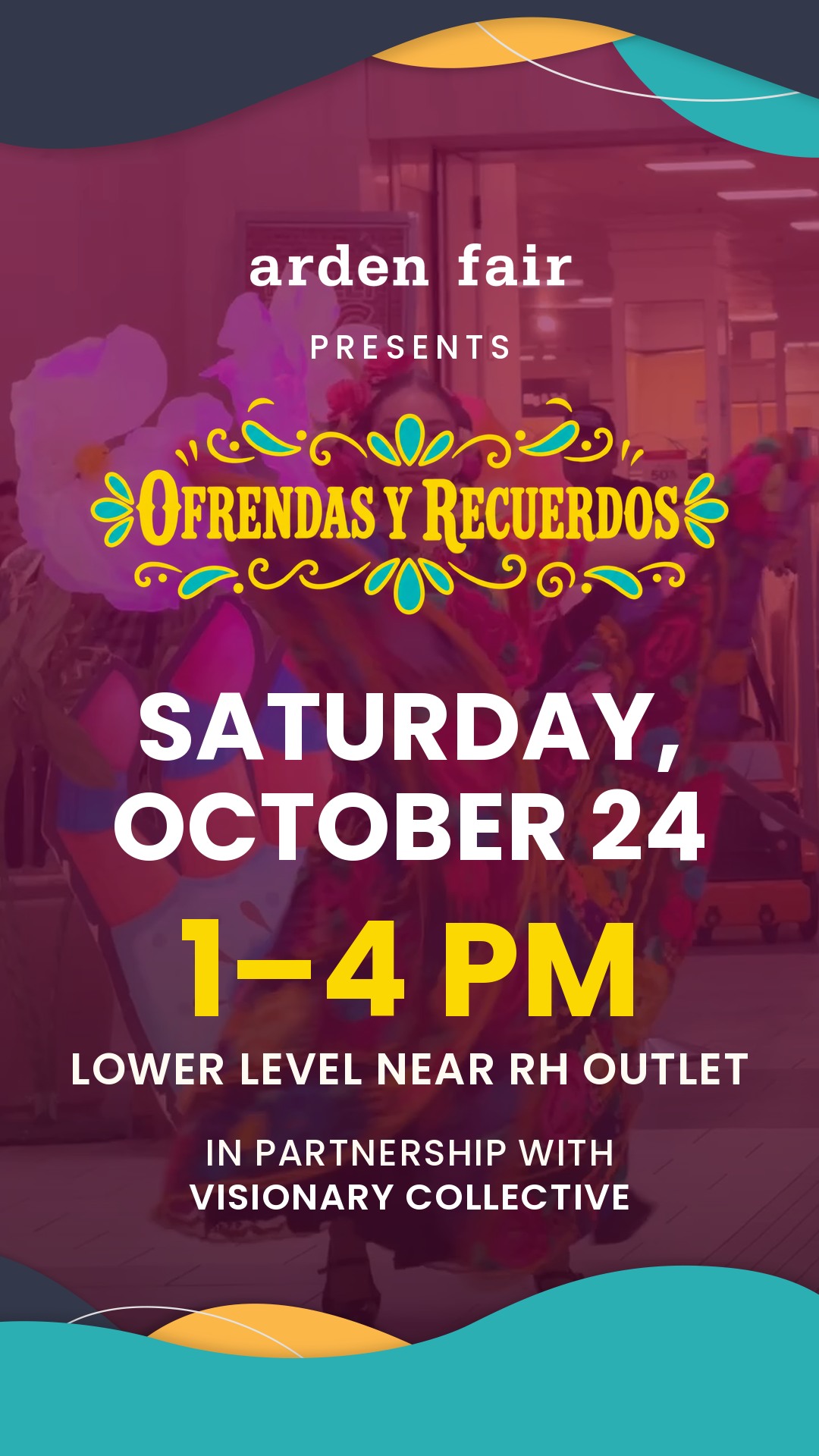
Alto
Graphic highesttop −110 · date 126 · time 174 · partner 48 — graphic pulled highest
Top asset pulled up 110px, so the artwork is a thin crown and the photo starts sooner. Keeps the lockup at full size.
F3_alto
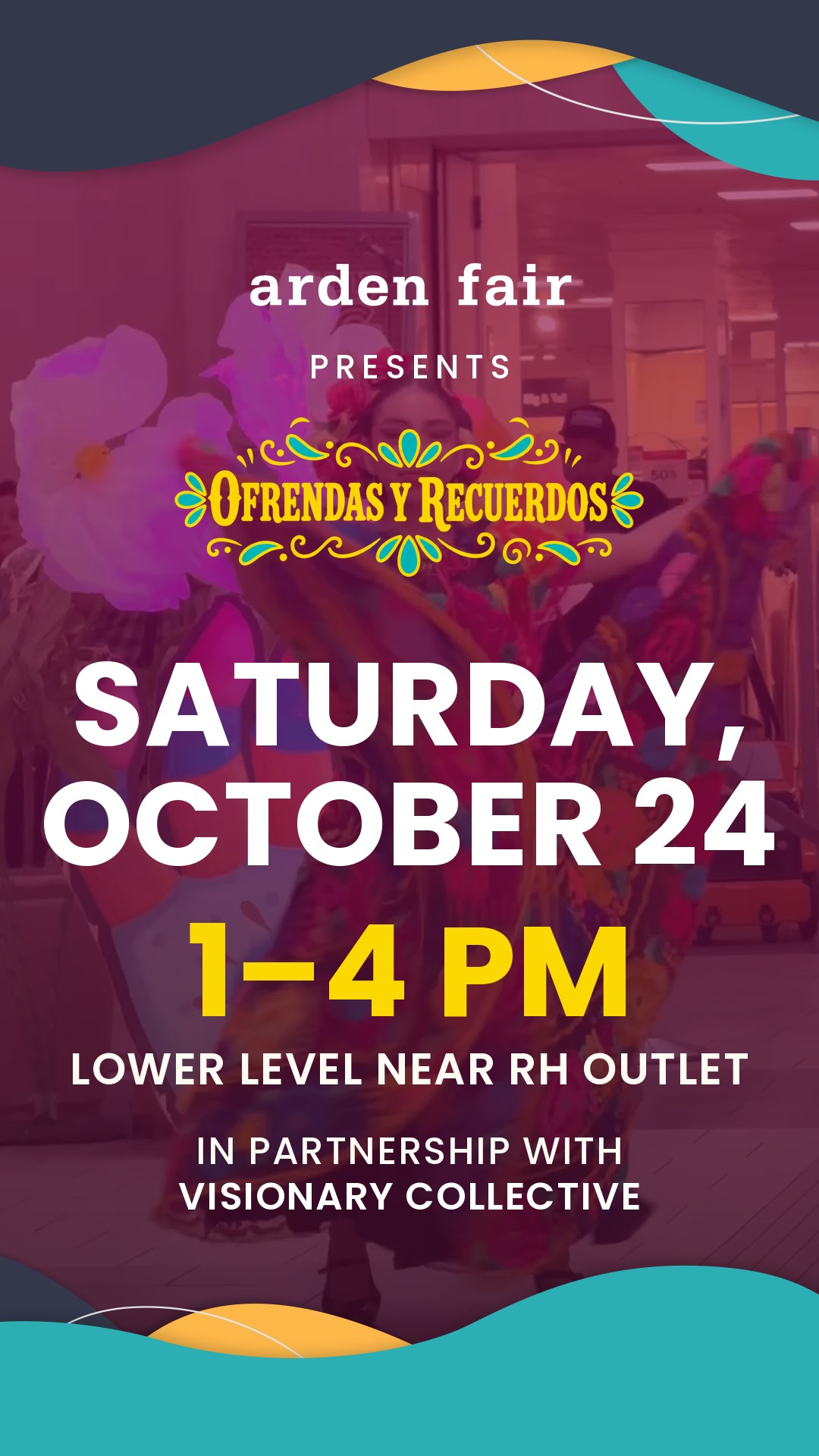
Igual
Date = timetop −80 · date 156 · time 168 · partner 50 — date and time the same weight
Date at 156 against a 168 time — they read as one block. The most emphatic, the smallest lockup.
F4_igual
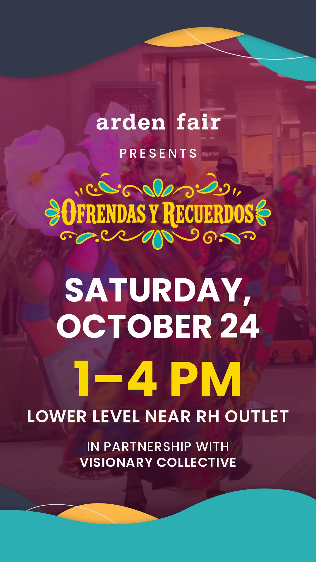
Aire
Roomiesttop −40 · date 112 · time 166 · partner 44 — the roomiest setting
Top asset only −40, date 112, generous leading throughout. The calmest setting.
F5_aire
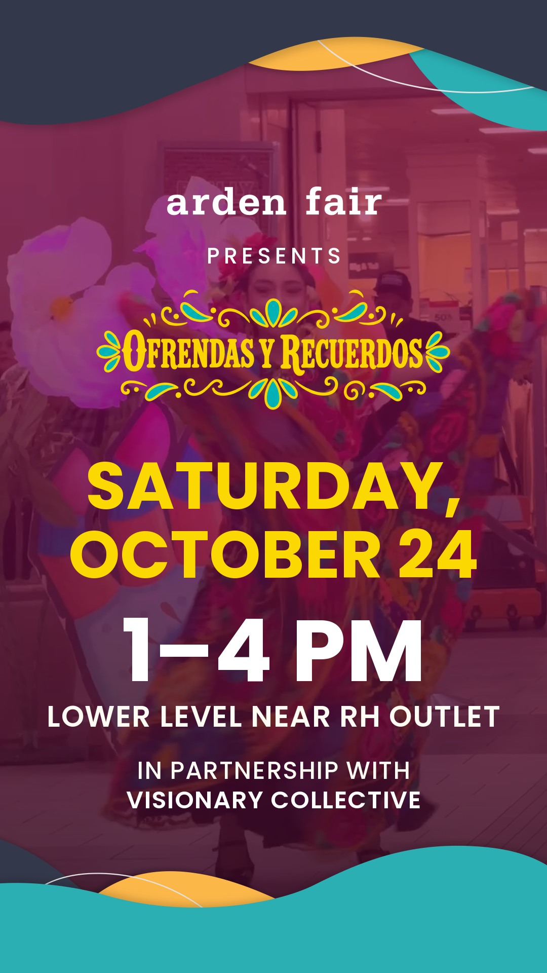
Oro
Colour swaptop −60 · date 130 in gold · time 172 in white · partner 48
Date in gold, time in white. Try it if the gold should land on the date rather than the hour.
F6_oro
Equilibrio. At 118 the date reads as a clear pair with the time without competing with it, and it leaves the largest lockup of the six — which matters, because the lockup is the only thing on the card carrying the event's identity. Alto is the close second if you want the top graphic higher still; it holds the lockup at full size.
If you want the date and time to read as one solid block, Igual — but note it shrinks the lockup most.
Asset applications
Bailarina × UnchARTed assets click any card for full resolutionBoth PNGs are exactly 1080 wide, so they drop in at native scale with no resampling. Their brand hexes differ slightly from the drawn palette I had been using — #323749 navy, #2AACB0 teal, #F4B146 amber — so the accents alongside them are now sampled from the assets rather than from my approximations.
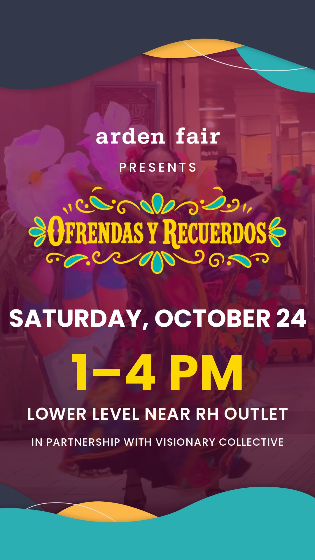
Flush
RecommendedAssets at native size, flush to both edges. The literal swap — nothing else about Bailarina changes.
The straight swap: assets at native size, flush to both edges. Nothing else about Bailarina moves, and the artwork sits at the scale it was drawn for.
B1_flush
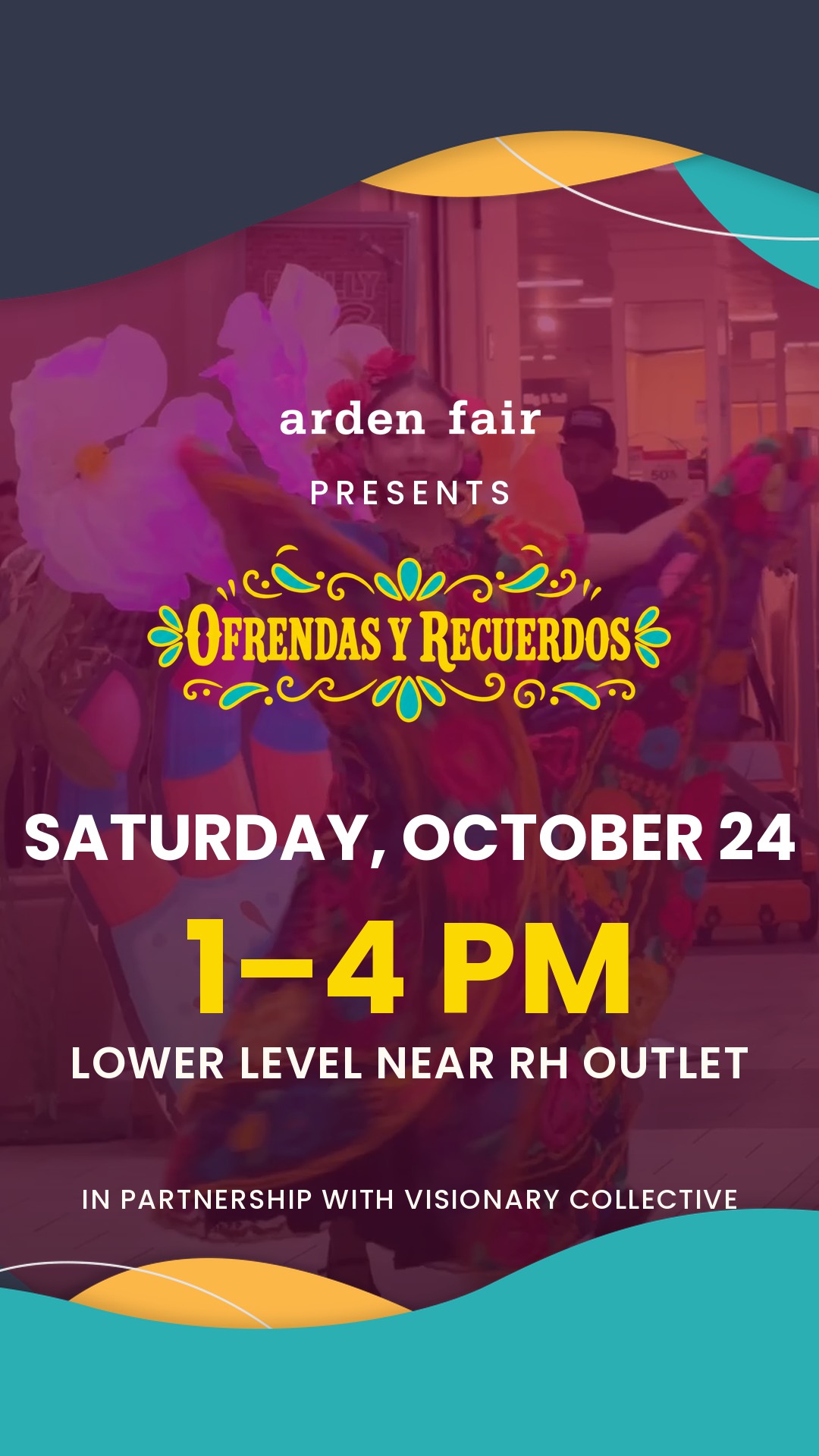
Profundo
BoldestAssets scaled 1.3×. Heavier bands, less photograph, strongest graphic presence.
Assets at 1.3×. The bands take more of the card, so the brand shapes lead and the photograph supports.
B2_profundo
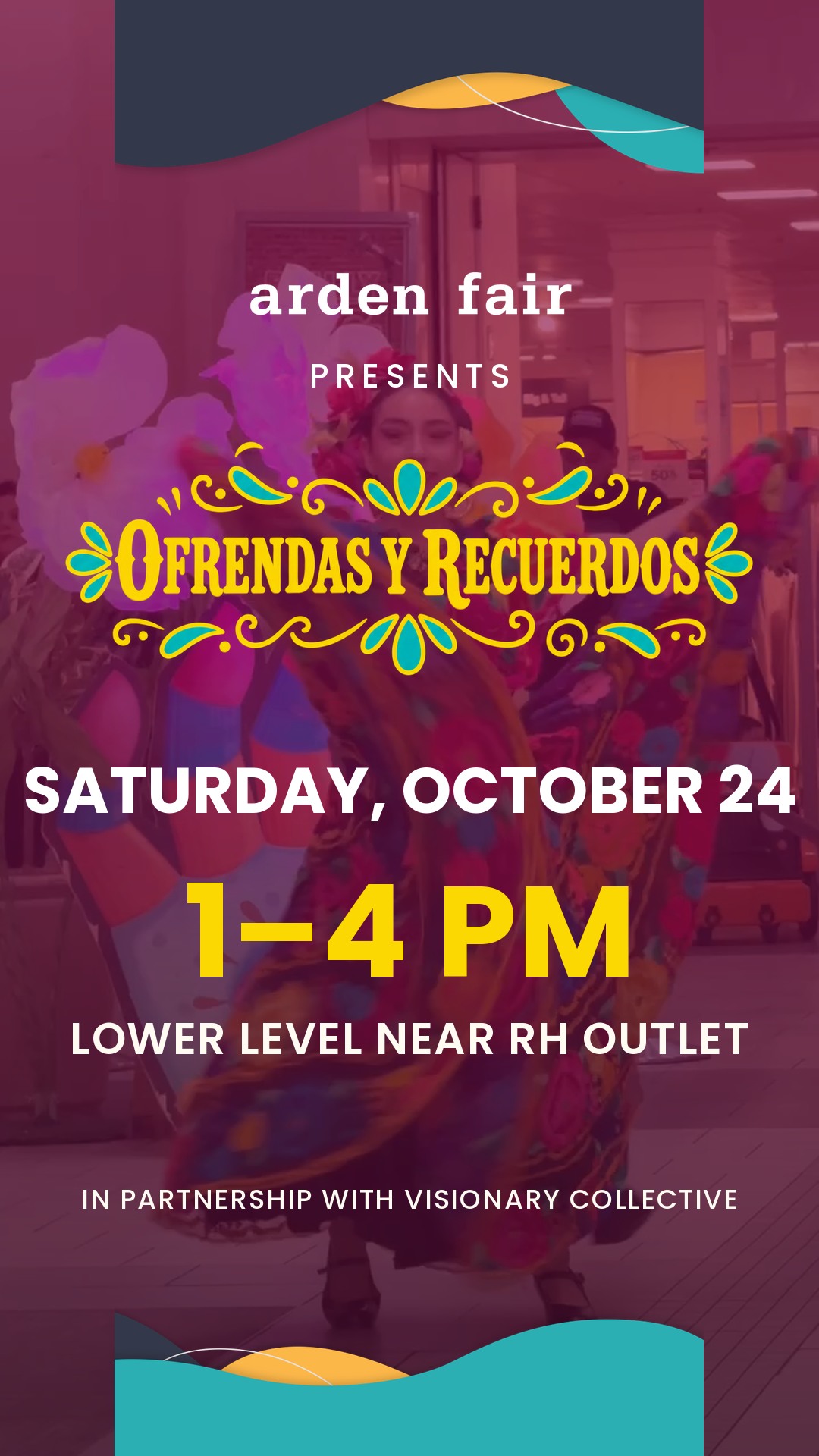
Sutil
QuietestAssets scaled 0.72 and the scrim lifted. A quiet trim; the dancer carries the card.
Assets at 0.72 with the scrim lifted. A trim rather than a frame — the dancer carries it.
B3_sutil
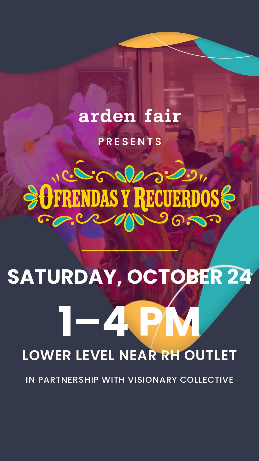
Repisa
Most legibleThe bottom asset raised and enlarged so its teal becomes a shelf the copy sits on — no text over the photograph.
The top asset flipped and enlarged into a shelf that holds every fact, with the lockup above it on the photo. No copy over the image at all.
B4_repisa
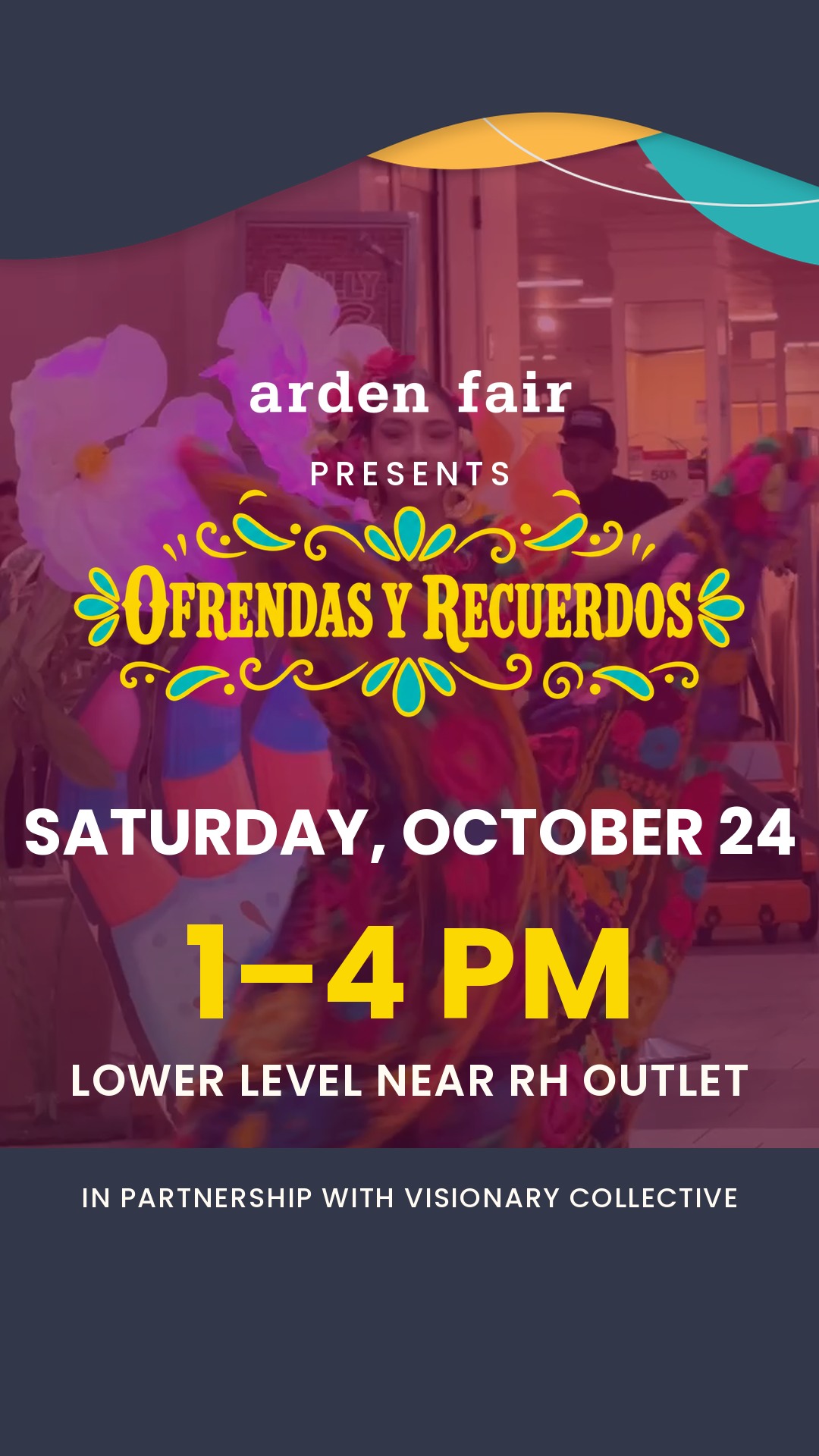
Solo
Cleanest baseTop asset only, scaled 1.12, with a navy footer bar for the partnership line.
Top asset only, with a navy footer bar for the partnership line. The photograph runs to the bottom edge.
B5_solo
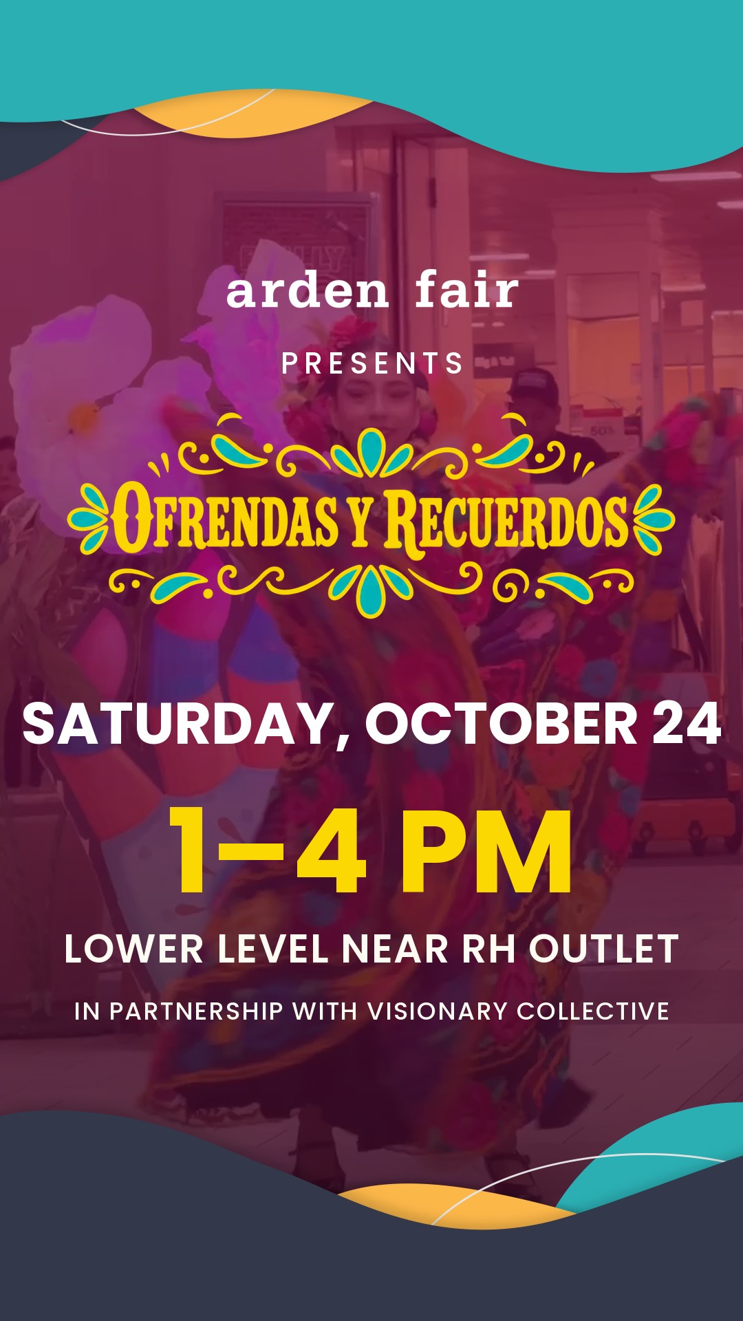
Invertido
InvertedAssets swapped end for end — teal leads at the top, navy anchors the base.
Assets swapped end for end — teal leads at the top, navy anchors the base.
B6_invertido
Flush. The assets were drawn at 1080 wide for a 9:16 frame, so at native size they sit exactly as intended — the wave crests land where the artwork wants them and nothing is resampled. It also keeps the most photograph of any version that still has both bands, which is the whole reason you picked Bailarina.
If you want the brand shapes to lead, Profundo. If legibility on a small screen matters more than the image, Repisa — it is the only one with no copy over the photograph at all.
Type hierarchy
the proposal you asked forA 1080-wide card is downscaled roughly 2.8× on a phone, so design pixels ÷ 2.8 gives the size in the hand. Five levels, applied identically across all eight new cards.
Two guardrails are enforced in code, not by eye: the copy block measures its own height and shifts up if it would reach the footer, and the partnership line ends at 1592px — 40px clear of the 1632px mark where Shorts and Reels start drawing their controls.
Round two — Clásico × Foto
8 designs · new type scale · partnership lineclick any card for full resolution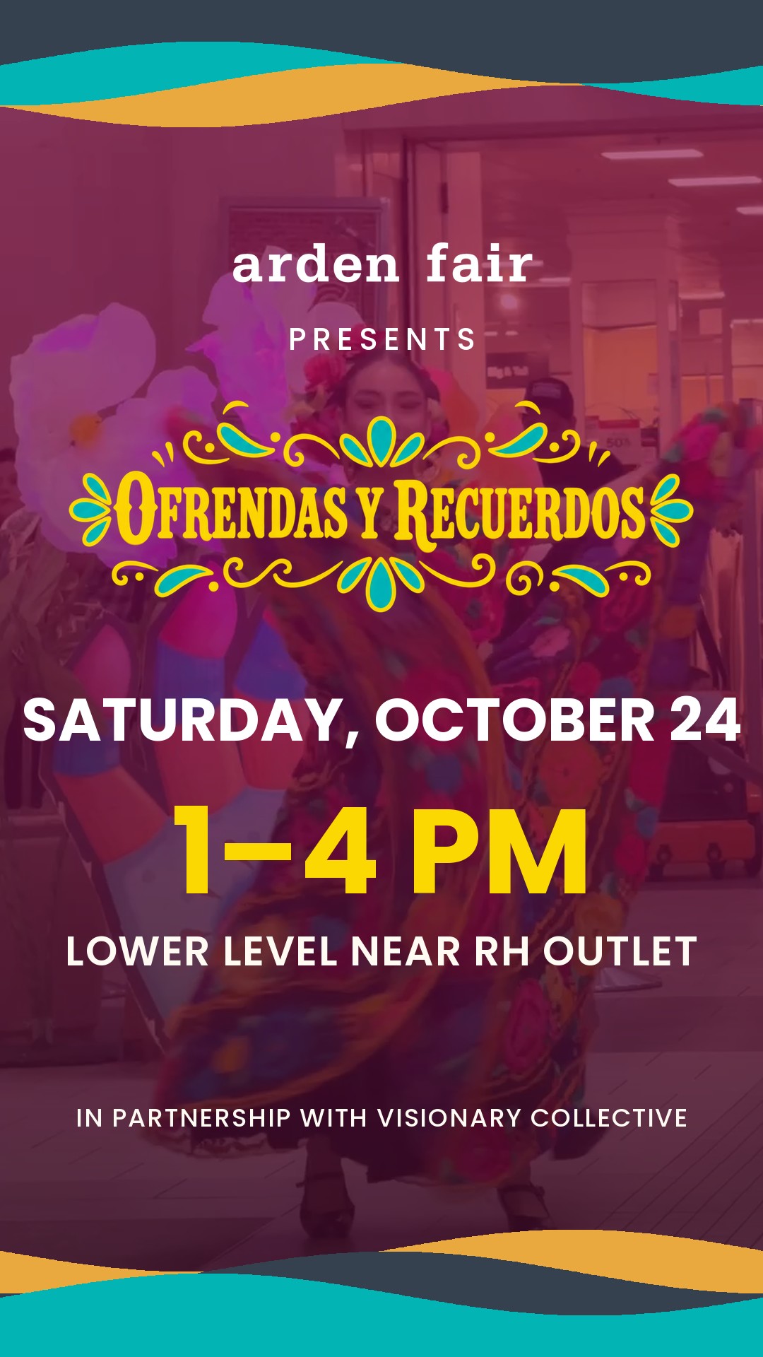
Bailarina
Straight crossFull-bleed hero dancer under a magenta wash, waves top and bottom. The straight Clásico × Foto cross.
Clásico's wave bands over Foto's hero dancer, nothing else changed. The literal answer to what you asked for.
09_bailarina
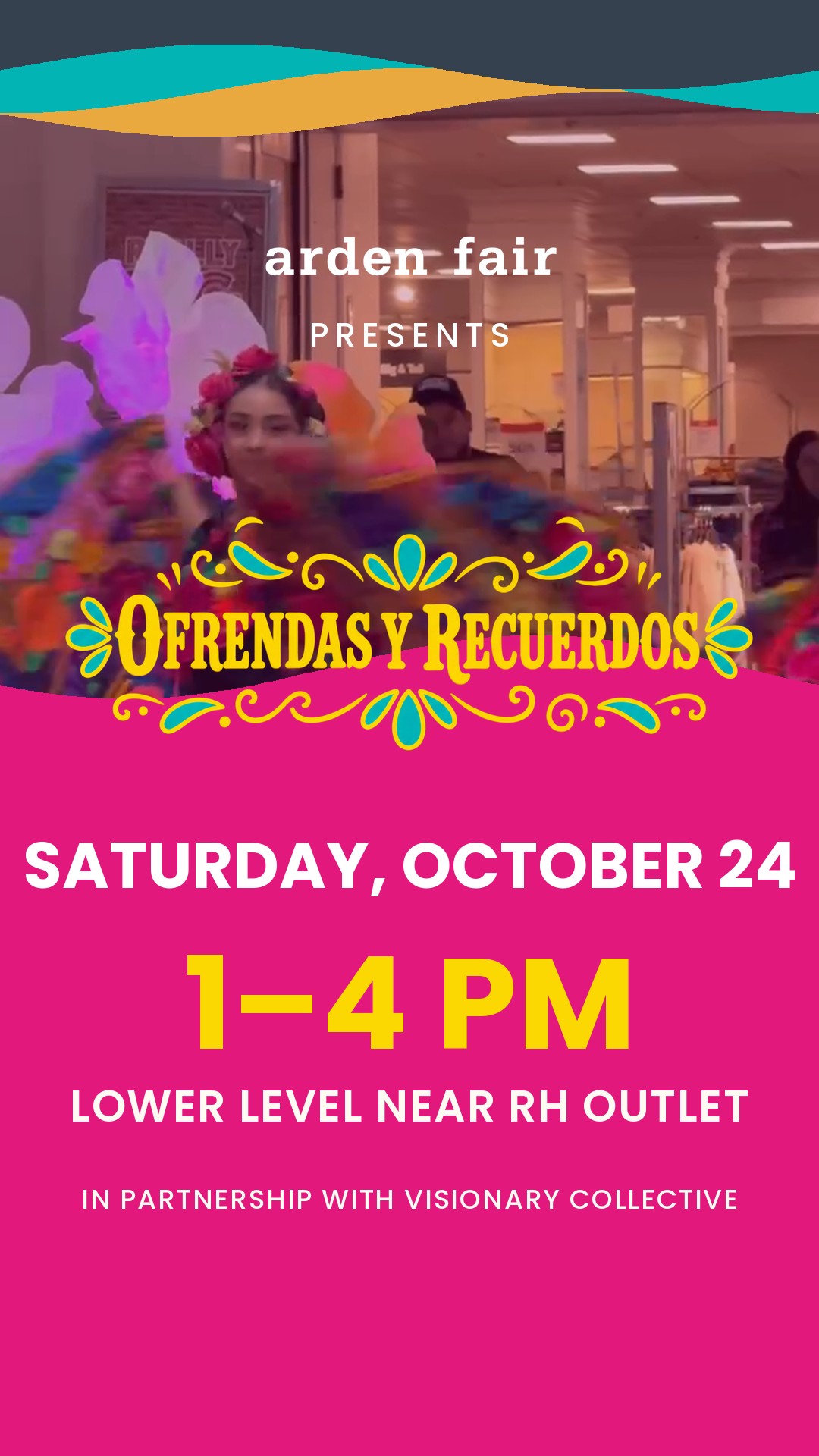
Repisa
RecommendedPhoto on top, a magenta wave shelf carrying every word below it. Cleanest split of image and copy.
A wave shelf splits the card cleanly: photograph above, every word below on solid magenta. Nothing is set over a busy image, so it survives a small screen better than any other card here.
10_repisa
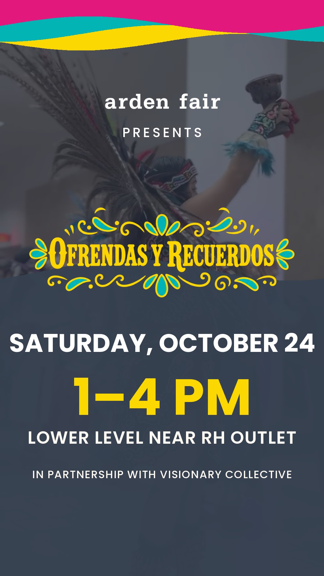
Azteca
Most ceremonialDanza azteca in navy duotone with a gold hero. The most ceremonial of the set.
Danza azteca in navy duotone. The gold hero line carries hard against it.
11_azteca
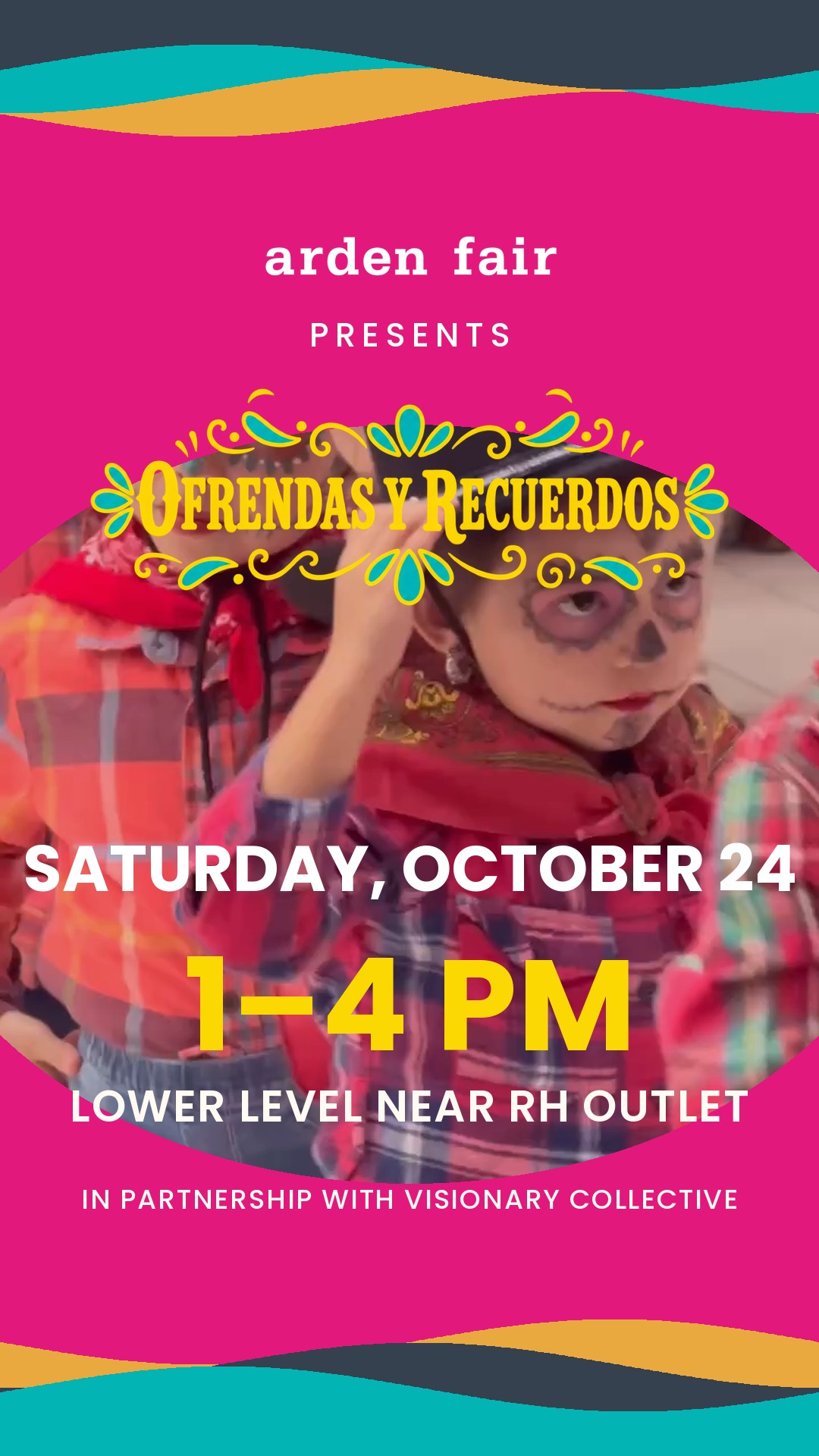
Arco
Most designedThe photo lives in an arc-cut window between the lockup and the date.
An arc-cut window holds the photo between the lockup and the date.
12_arco
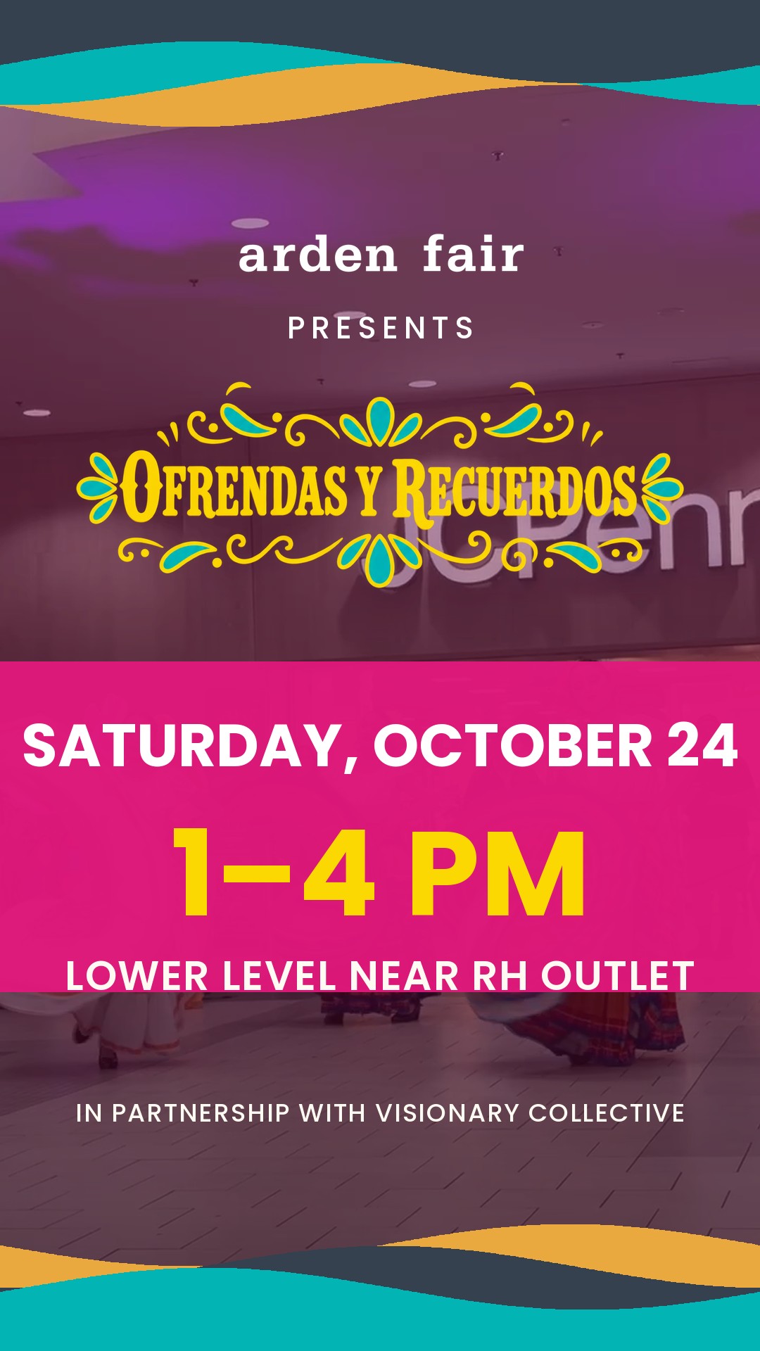
Banda
Most cinematicPhoto runs full height; a magenta band across the middle holds the date so it never fights the image.
Photo runs the full height; a translucent band holds the date so it never fights the image.
13_banda
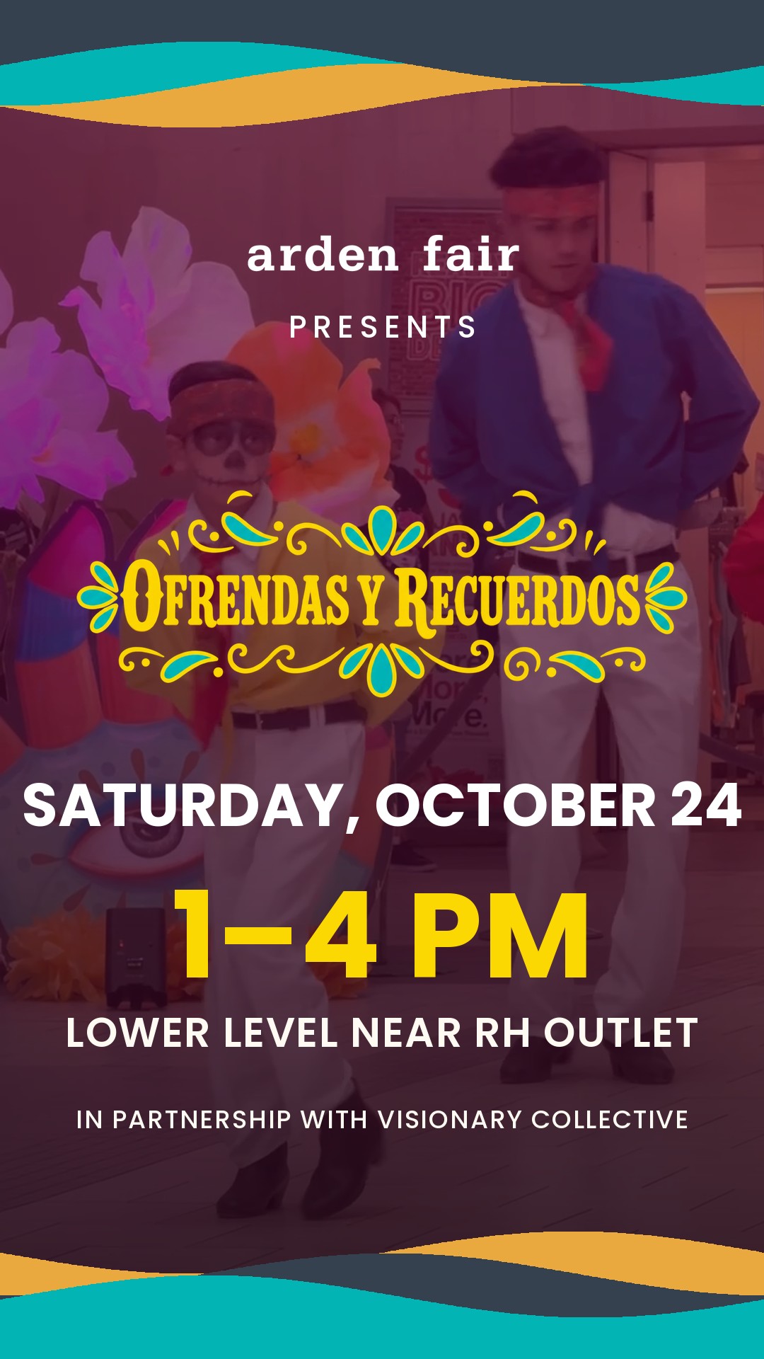
Calavera
WarmestPainted kid close-up, deep scrim, date leading. Warmest and most face-forward.
Painted kid close-up. The most human card and the most likely to be shared.
14_calavera
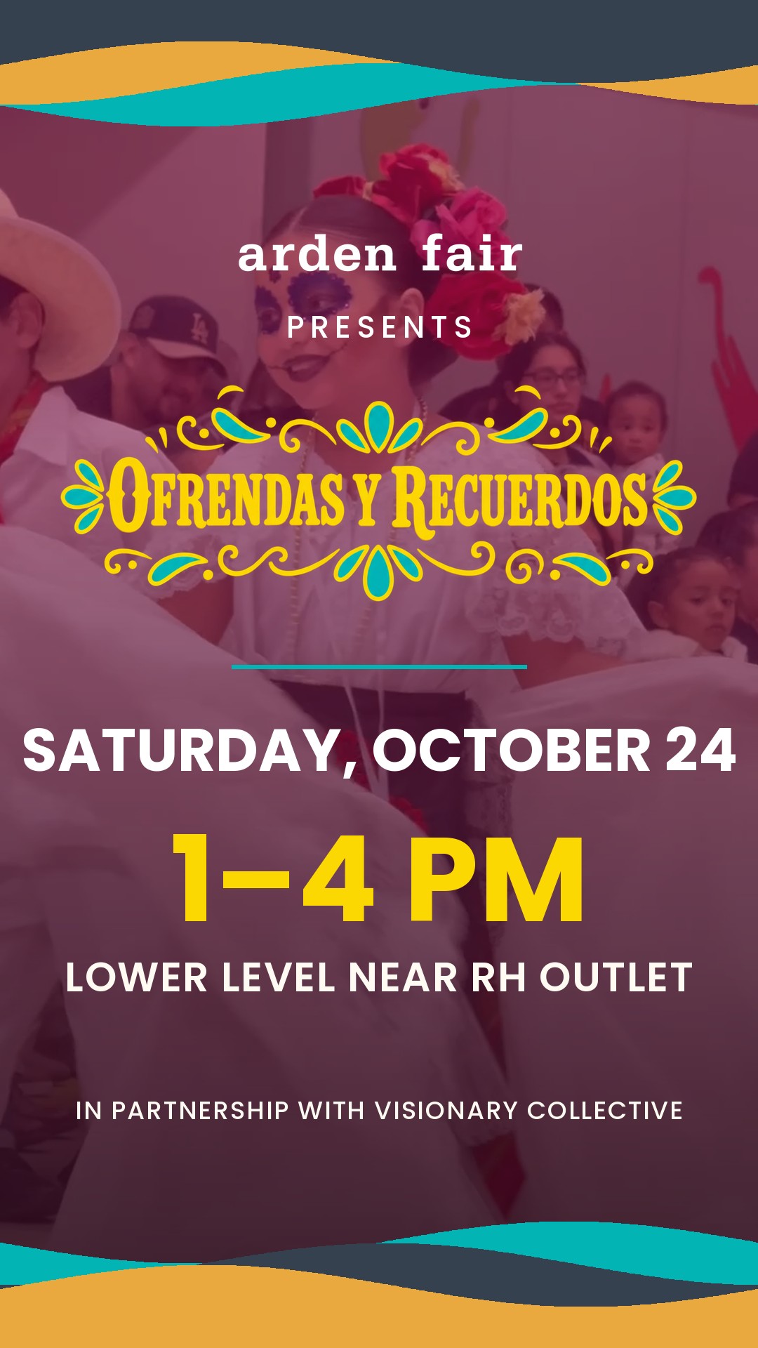
Catrina
Most elegantCatrina portrait with a teal rule under the lockup. Teal-led wave order.
Catrina portrait, teal rule, teal-led wave order — the coolest palette of the eight.
15_catrina
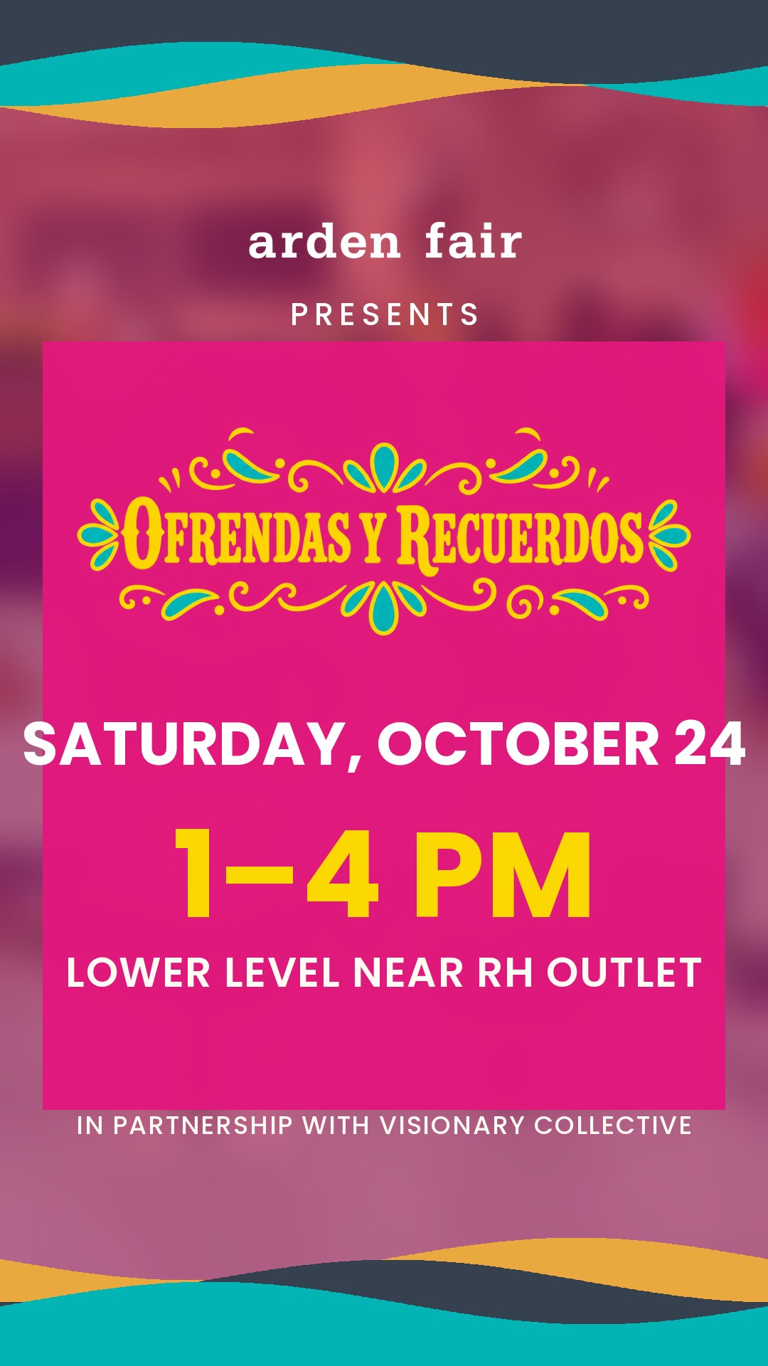
Plato
Safest readBlurred footage bed behind a near-solid plate. Highest contrast — the safest read on a small screen.
Blurred footage bed behind a near-solid plate. Highest text contrast in the set.
16_plato
Repisa. The wave shelf does the one thing every other photo card has to fight: it puts the photograph above the line and every word below it on solid magenta, so no copy is ever set over a moving, busy image. On a phone that is the difference between reading the card and squinting at it — and it still keeps a dancer on screen, which was the point of crossing Clásico with Foto.
If you want the image to dominate, Banda holds the date on a translucent band over full-height footage. For the warmest read, Calavera. For maximum legibility in any feed, Plato.
Round one
8 designs · graphic, no photography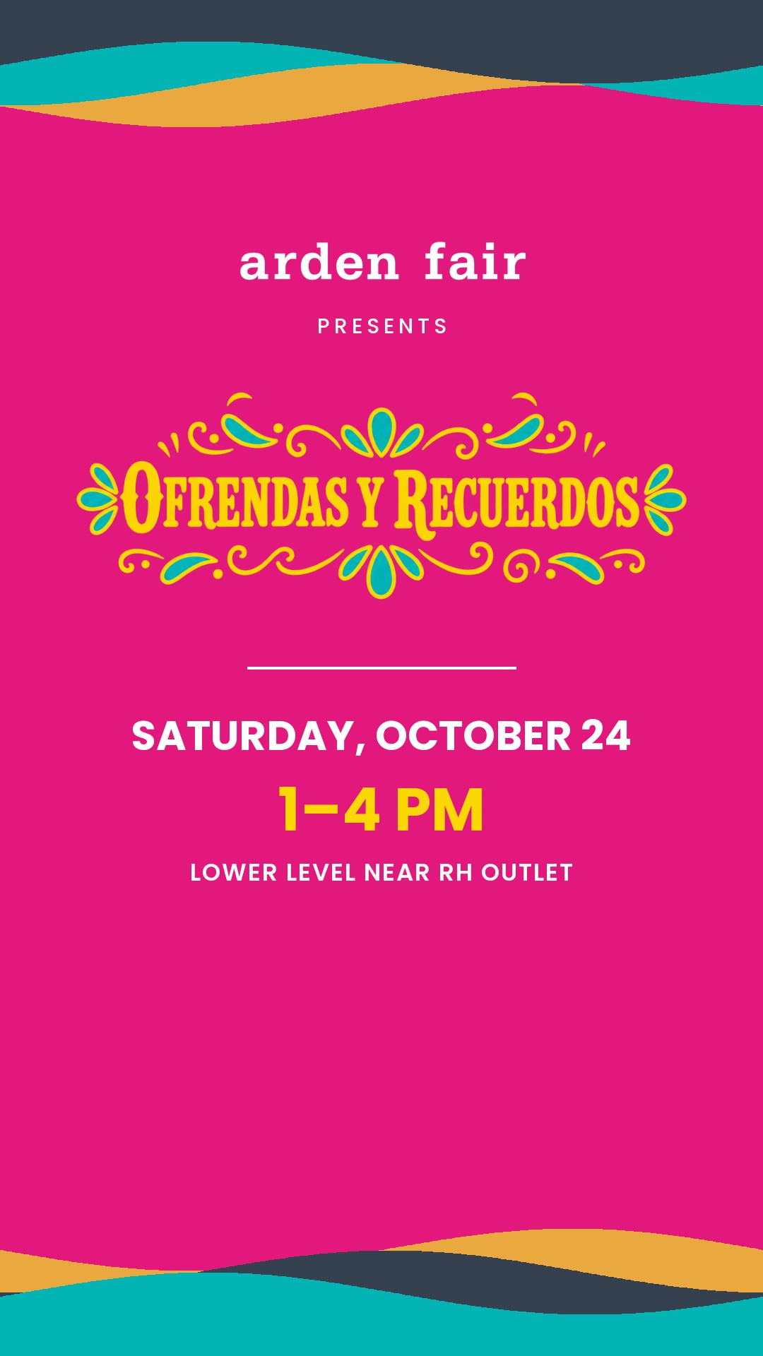
Clásico
SafestMagenta field, wave bands top and bottom. The evolved version of what's on air now.
Closest to what's on air, so nothing about the spot has to change around it.
01_clasico
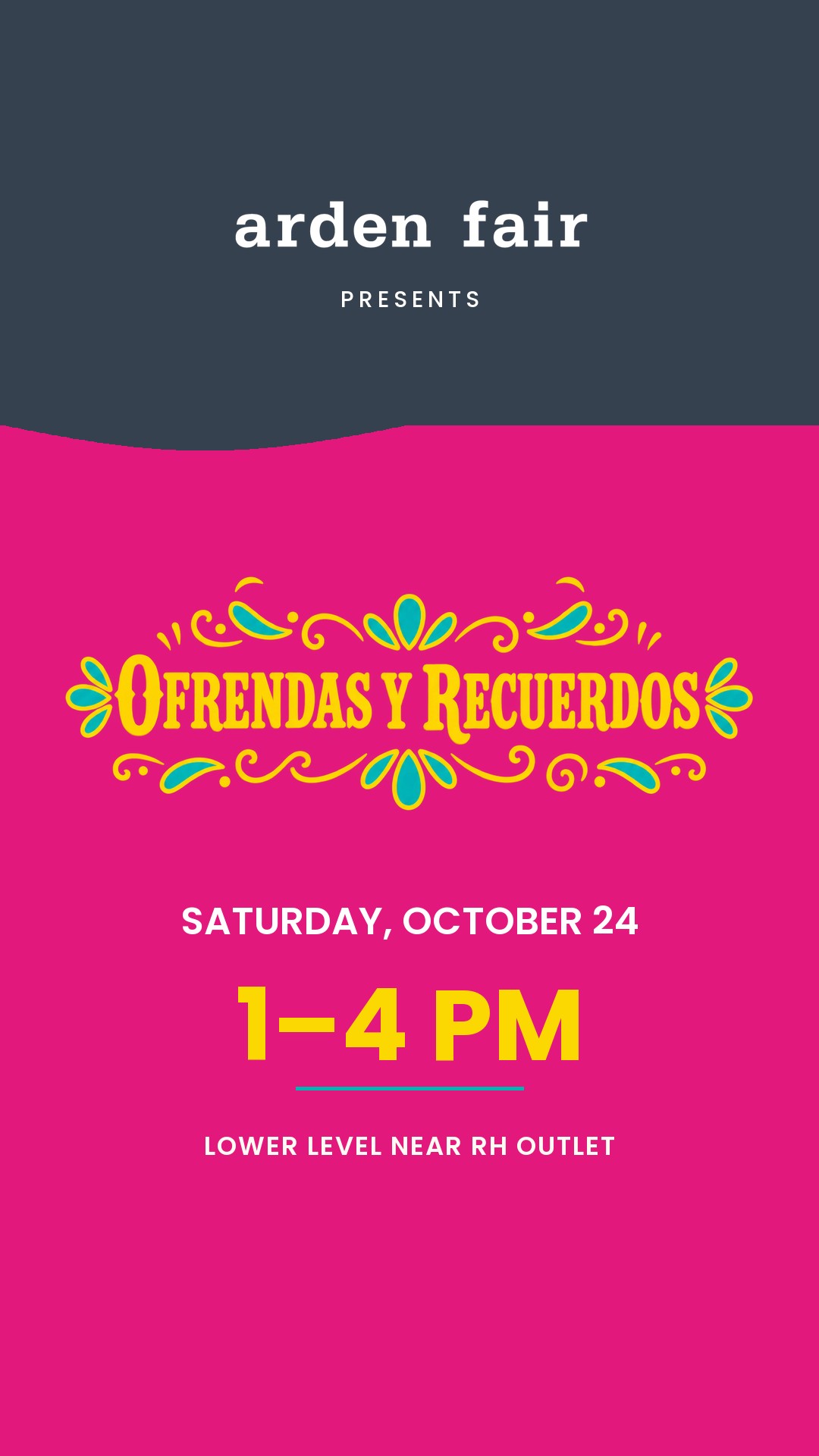
Bloque
RecommendedNavy header block carries Arden Fair, exactly like the flyer's top-left corner. Biggest time-of-day type.
The navy header is lifted straight from the flyer's top-left corner, so the card and the printed piece read as one system. Largest time-of-day type in the set — the thing a scroller actually needs.
02_bloque
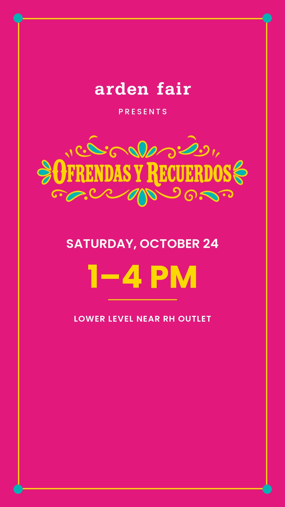
Marco
Most formalGold hairline frame with teal corner dots. Reads as an invitation rather than an ad.
Reads as an invitation. Lovely still; the frame eats width that the copy could use.
03_marco
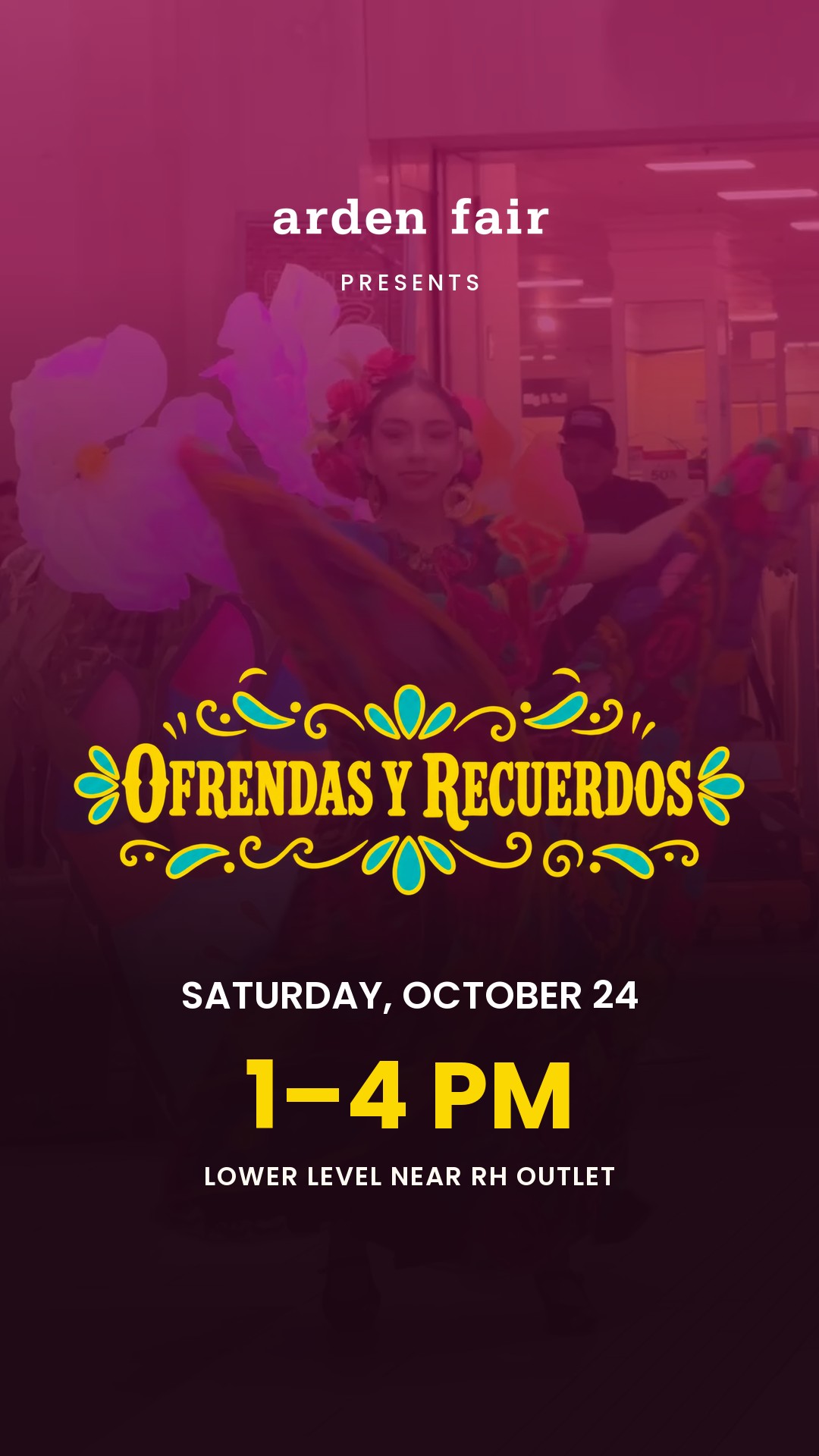
Foto
WarmestA real frame from the cut behind a magenta wash. The only one that keeps a dancer on screen at the CTA.
The only card that keeps a dancer on screen at the CTA, so the ad never stops being about people.
04_foto
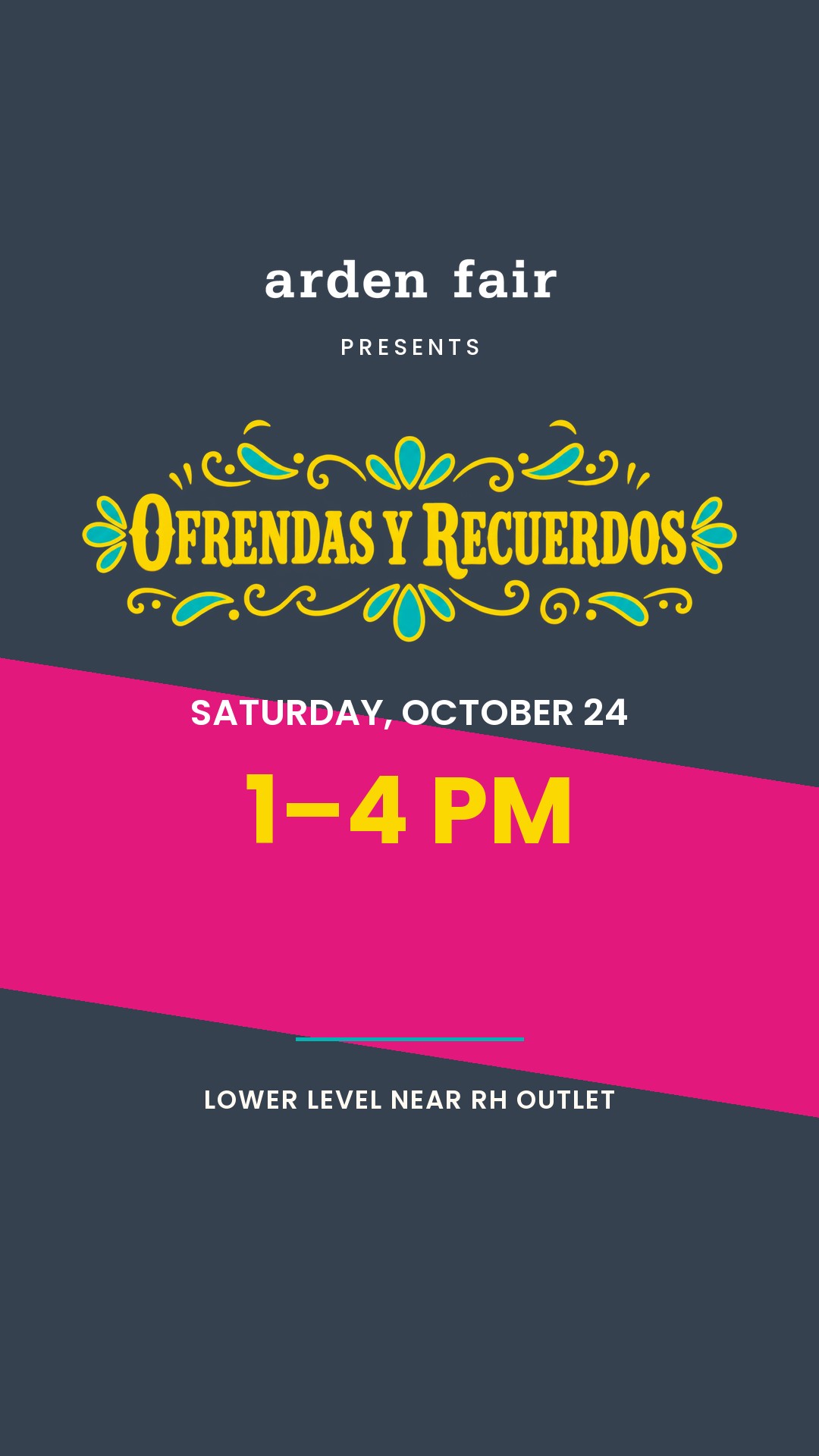
Cinta
Most kineticNavy ground with a raked magenta ribbon under the date. The most kinetic of the set.
The raked ribbon carries motion into a static card — good if the cut lands hot.
05_cinta
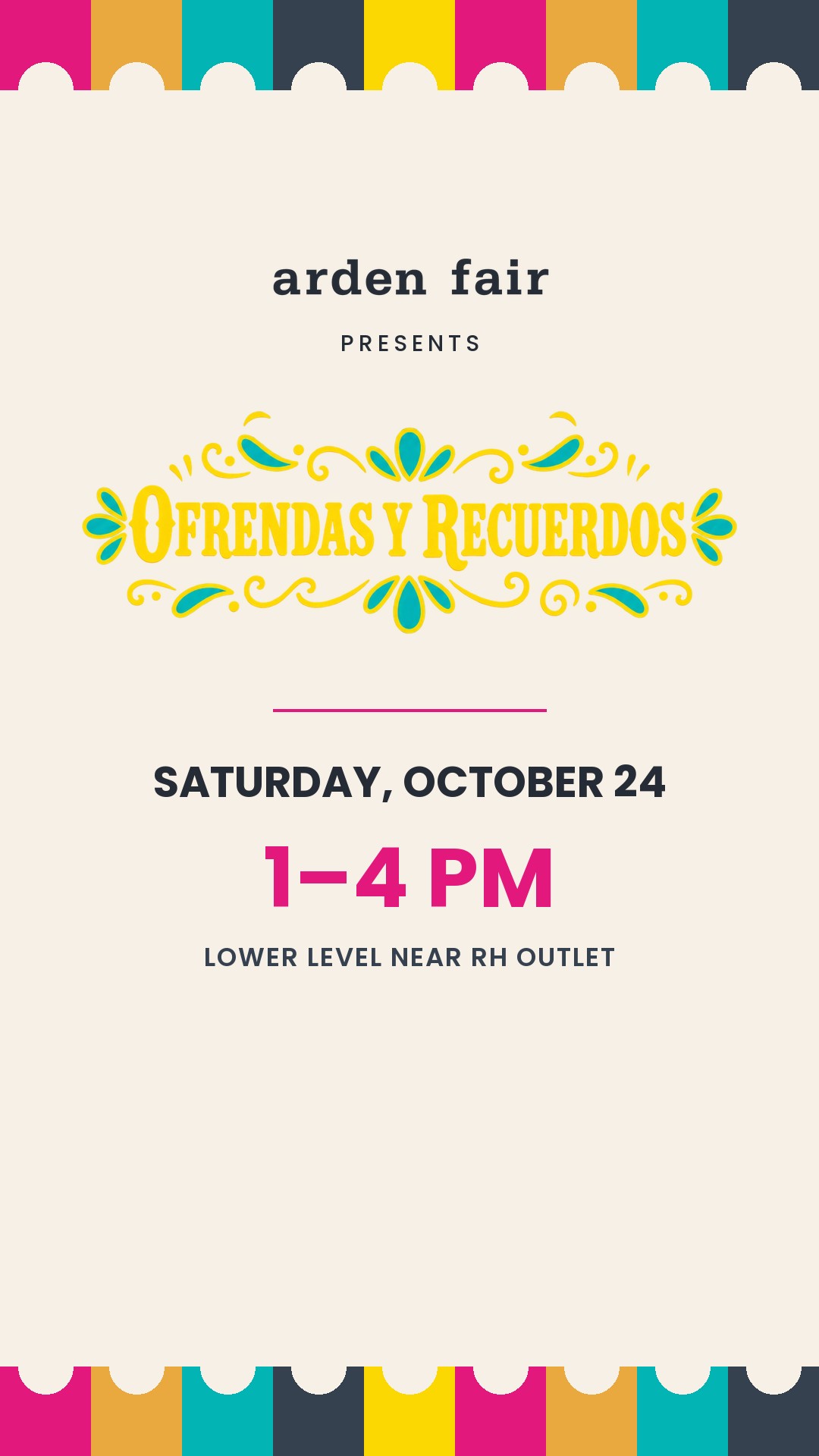
Papel
Best in a dark feedBone ground, papel-picado bands, magenta type. Inverts the palette so it cuts through a dark feed.
Inverts to a bone ground. Stands out hardest in a dark UI, and the only one that reads as print.
06_papel
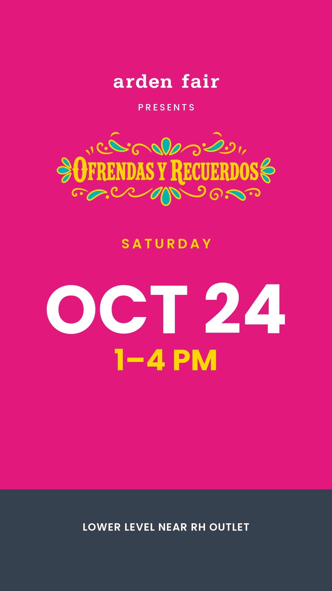
Fecha
Most directThe date is the hero — OCT 24 at 220px. Built for a viewer who already knows the event.
Date at 220px. Best for retargeting, where the viewer already knows what the event is.
07_fecha
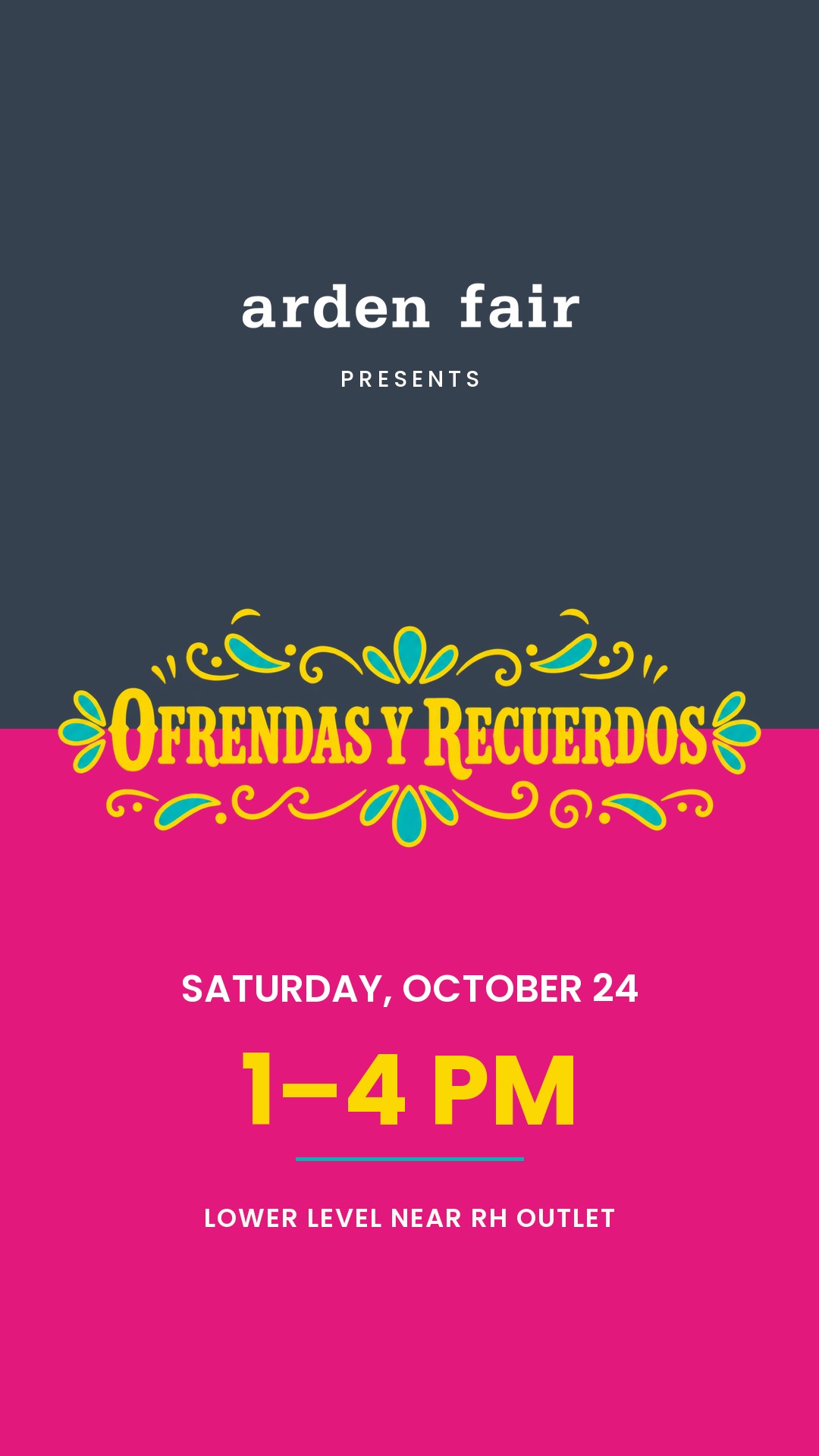
Doble
BoldestNavy over magenta with the lockup straddling the seam. Strongest pure graphic device.
The lockup straddling the navy/magenta seam is the strongest pure graphic idea here.
08_doble